AI Observe 360
An enterprise AI model guardrail portal that monitor LLM & ML ethical engagement, identify and solve ML data risks
About
Project Type / Enterprise SaaS, AI guardrails
Role / Lead UX Designer, Researcher
Stakeholders / PM, AI Engineer, Data Scientist
Timeline / Nov 2024 - Mar 2025
As Kimberly-Clark continues to integrate AI solutions across every step of its business operations, understanding the engagement, value, and risks of these tools is critical to effectively leveraging AI for decision-making while minimizing legal and compliance risks related to data misuse.
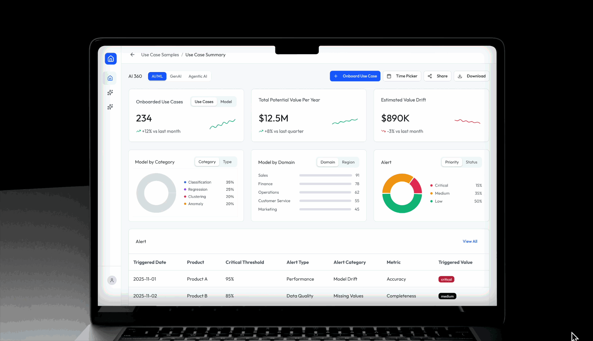
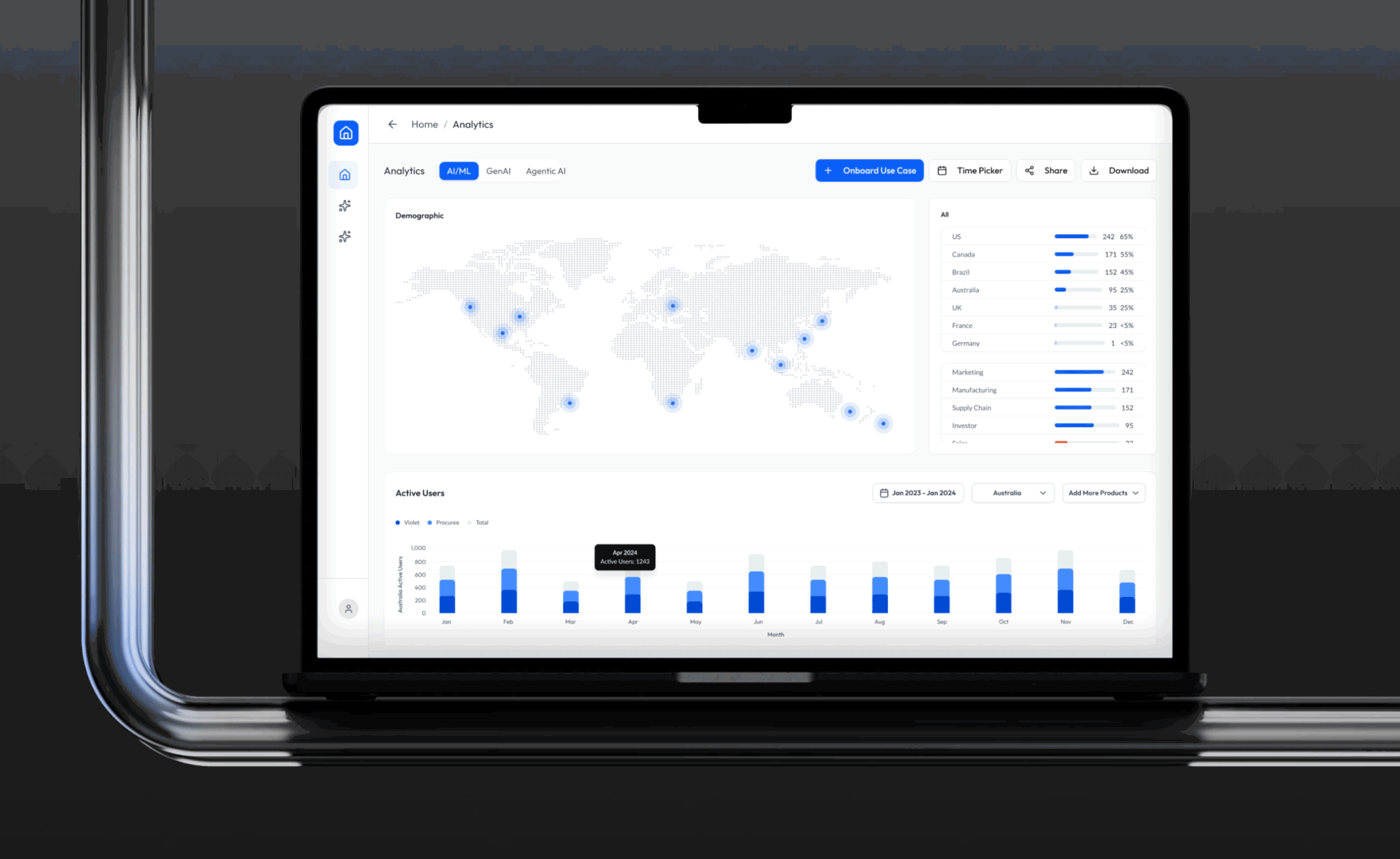
Powered by real engineering insights, the system enables users to monitor analytics on LLM keyword trend, ML data alerts, and Agentic AI engagement—from high-level overviews to deep-dive analyses.

Challenges
0→1 initiative
Navigate ambiguity around AI model structures
Design a storytelling analytics journey that transforms data into actions.
AI 360 began as a 0-to-1 initiative with no existing infrastructure to build upon. This meant we started without clear visibility into how AI models were architected, what metrics mattered most to users, or how those metrics should connect to form an intuitive and insightful narrative.
Our challenge was to design a system that not only made AI performance data discoverable and comprehensible, but also turned those metrics into meaningful stories that could drive informed business decisions—beyond just numbers on a dashboard.

But what are the metrics for AI/ML Models users are looking for?
Leadership


Although all users start at the overview, but project managers and engineers need to dive into detailed use-case views. Because these pages mirror the complexity of how AI/ML setups, our design needed to bring clarity without sacrificing any essential information.


AI Engineers
Action-biased approach

Not everything needs to start from research, for this project action-first approach allow us to move faster and iterate earilier.
Instead of running broad surveys to capture every possible metric, we partnered directly with stakeholders validated them with which revealed a clear pattern: leadership prioritized organization-wide engagement, while AI engineers focused on model performance. These behavioral insights shaped the initial “Overview → Deep Dive” structure of AI 360.
How might we bring clarity to AI model structures that are inherently ambiguous and difficult for users to comprehend?
Deep Dive
Design Perspective
Solution:
Aligned terminology with clear diagrams.
Adapted the journey to engineering’s mental model.
Improve the journey with UX principles grounded in the shared alignment.
Engineer Perspective

Misalignment:
Shared terms didn’t equal shared understanding—design and engineering defined “products,” “features,” and “use cases” differently, leading to a broken product hierarchy and a confusing exploration flow.
Design sees a hierarchy of Product → Features → Models, while developers treat anything using a model—product or feature alike—as a “use case,” because model quality controls all feature behavior.

Learning that is crucial for design to suggest the deep-dive journey start at the product level and let users move directly between the data models powering it, bypassing feature-level complexity.
With the high-level architecture aligned, we began to craft the experience leading to the goal of action-driven data monitoring experience.
Data Storytelling
Monitoring Item
OPTION 1 (business value)
OPTION 2 (business value)
Category
Actions
Impact
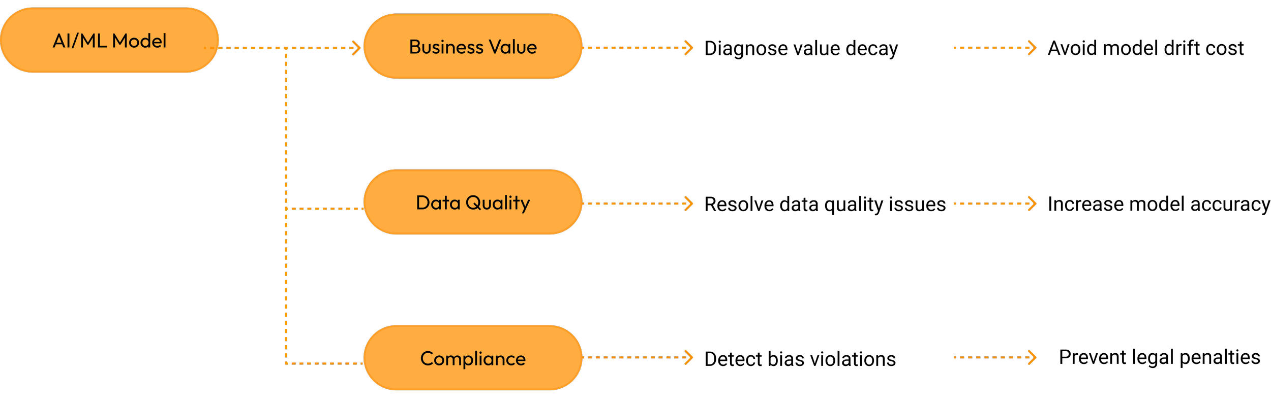
The AI/ML monitoring scope was originally defined across three focus areas. However, mid-project, business stakeholders challenged the direction, leading us to shift priorities. Instead of spinning off an entirely new monitoring section, I reframed the proposal to emphasize the long-term value of all three areas while recommending a short-term focus on the most feasible ones—those with manageable technical complexity, fewer operational constraints, and, most importantly, reliable data that didn’t rely on heuristic assumptions.


Stakeholder Concerns:
High Cognitive Load: Especially for those unfamiliar with AI/ML performance monitoring.
Weak Storytelling Hierarchy: The cause-and-effect flow is implicit, making the data exploration journey—Potential value decay → accuracy → drift → data quality—hard to comprehend.
Lower Engagement With Actions: Real data quality issues are buried at the end, causing deviation from the root reason for value decay.
UX Concerns:
Requires step-by-step Interaction to See Full Picture: Some users may not click through, missing important metrics unless prompted
Inefficient for Expert Users: For users who already learned the process, they might want to skip the flow.
Work Around:
Added a Root Cause Summary:
Provides instant insights linked to their graphs for clarity and trust.
Toggle to Switch Views: Guided Mode ↔ Expert Mode
Instructional Design Enhancements:
Introduced numbered steps across the diagnostic journey to illustrate cause-and-effect order.
OPTION 1 (Compliance)
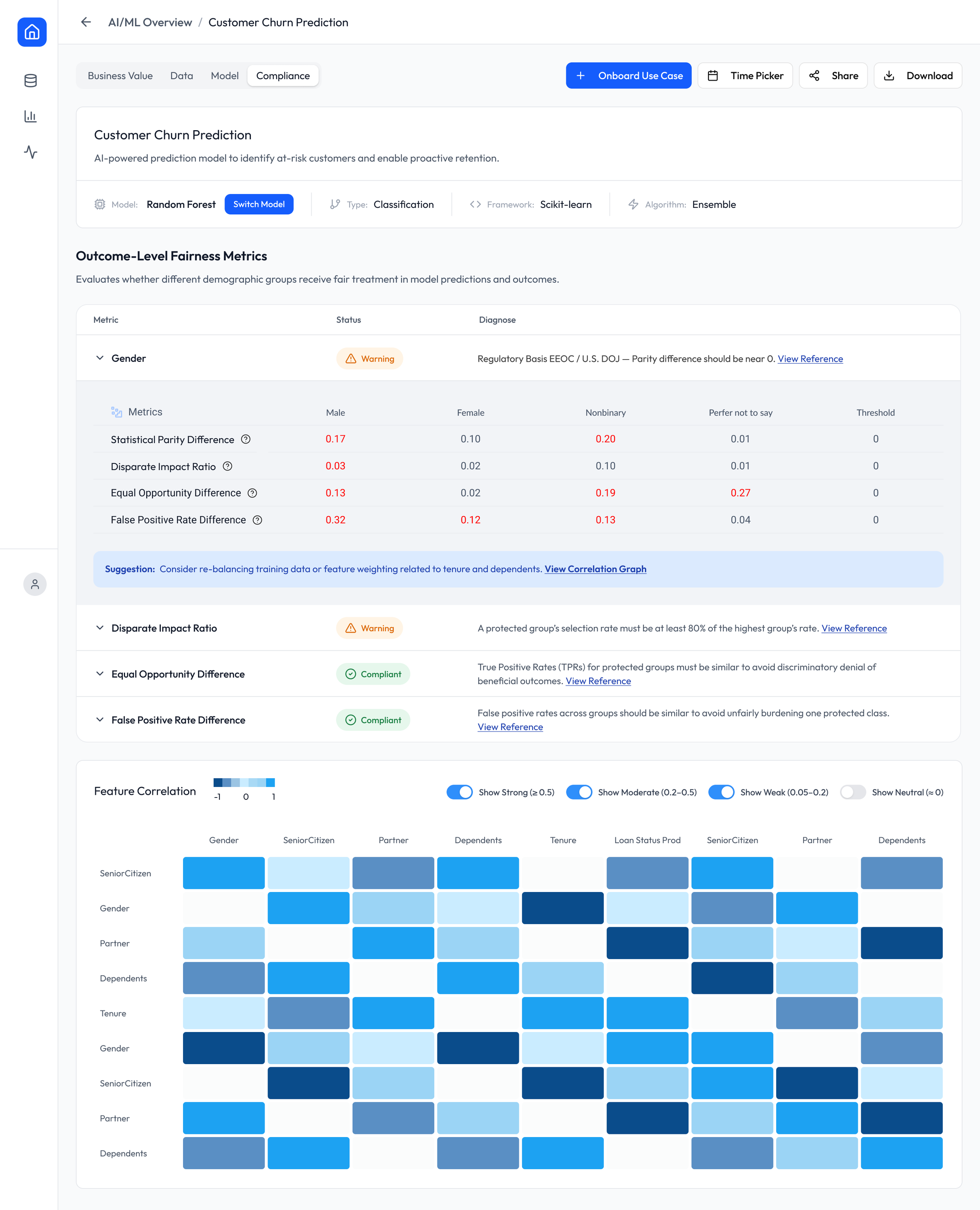
OPTION 2 (Compliance)
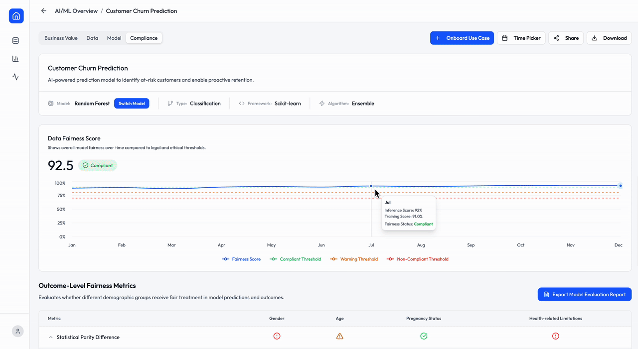
Legal Users Ask:
Legal users shared that the original workflow felt backwards: Analysis is technically driven starting from model risks, which is not how the legal team works. Legal reviewers begin with regulatory principle violations and then deep-dive into the reasons behind them.
Developer Ask:
Viewing legal principles at the first layer makes it harder to diagnose which data attribute is causing the issue. Developers need scanability across multiple attributes to identify the root cause.
Work Around:
Move legal principles to the first layer, label them with high-level attribute risks, then allow users to expand into detailed explanations that build legal trust and provide troubleshooting guidance.
Compliance Score → Regulatory mapping → Attribute Details → Correlation Diagnosis.
OPTION 1 (Data Quality)
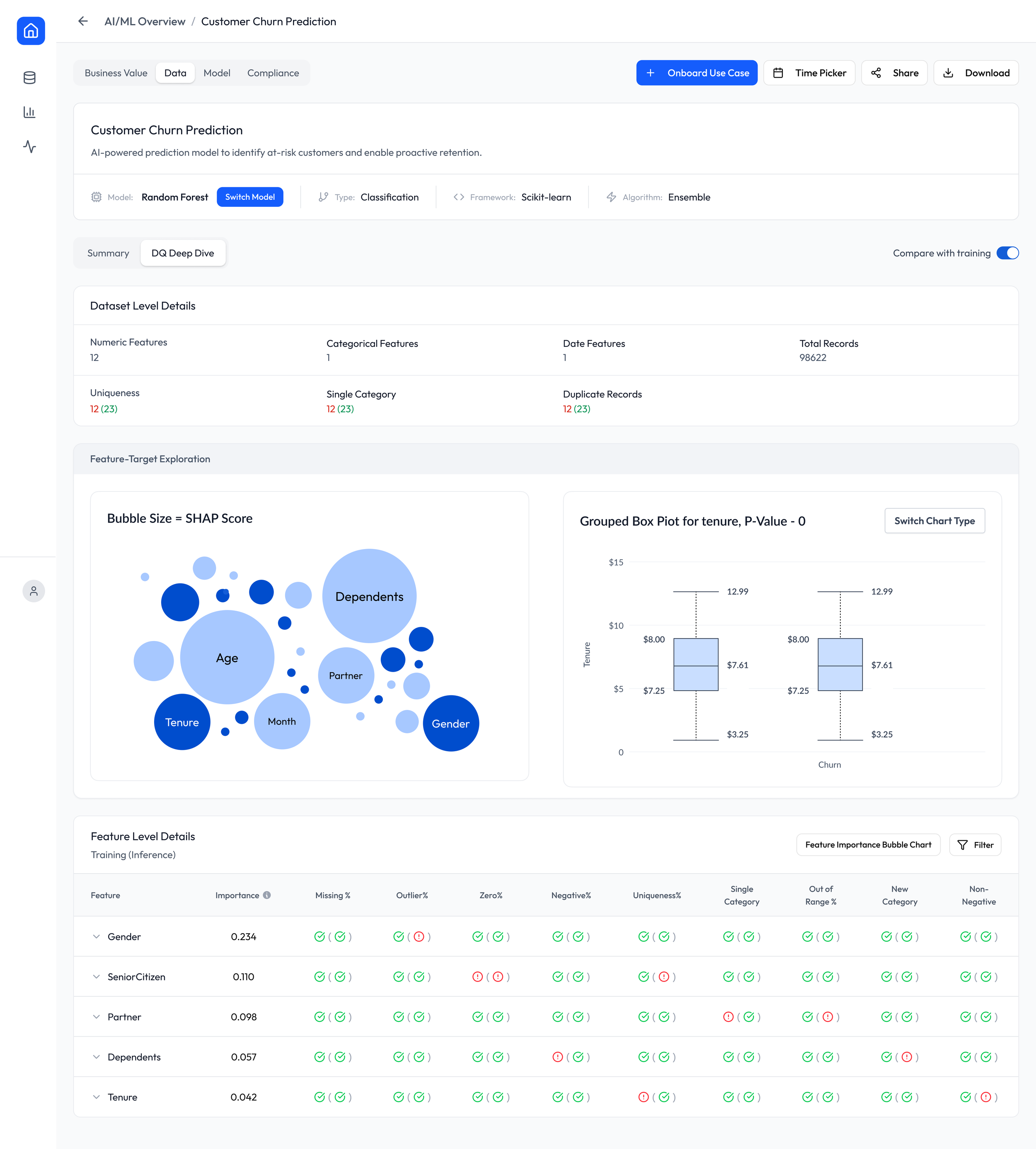
OPTION 2 (Data Quality)
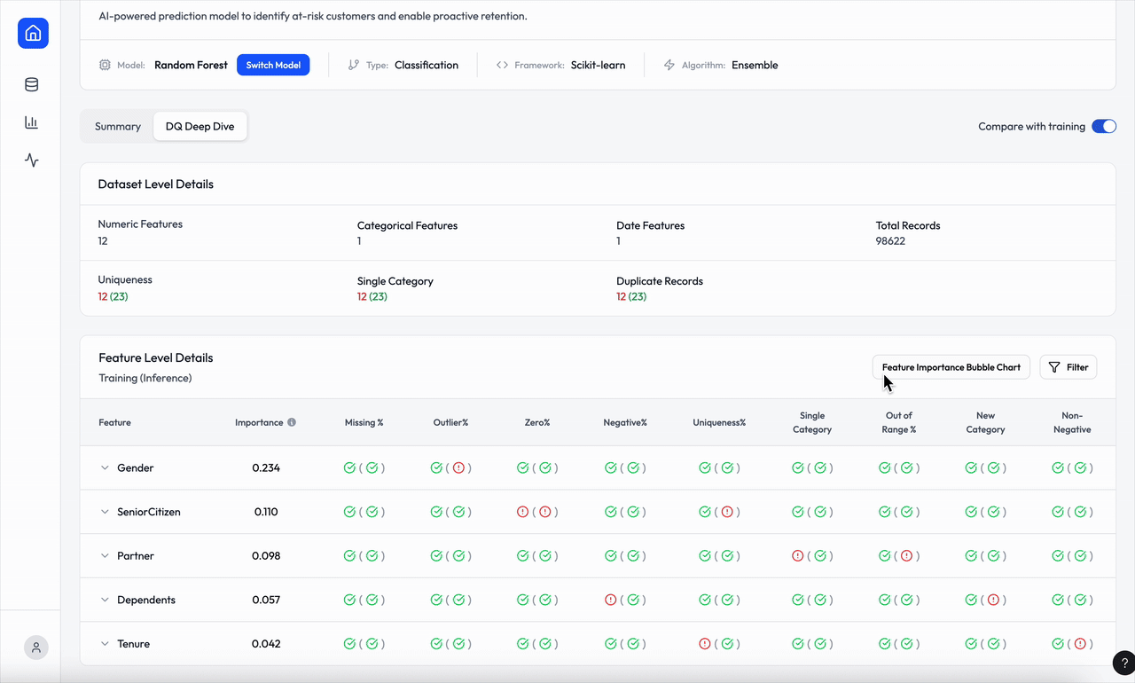
UX Concern:
Stakeholders need the bubble chart and the box plot to show the analytic ability of the platform but as the UX owner, I raised several concerns:
Misalignment with Primary User Goal Users approach this page expecting answers like:
“What’s wrong with my data?”
“Where are the anomalies?”
“What should I fix?”
Bubble charts and box plots answer different questions:
“Which feature is important?”
“What does the distribution look like?”
This disconnect can hurt comprehension.
Work Around:
Reuse the existing table component to communicate bubble-chart insights by adding a sortable Importance column, while still allowing users to click and view the full bubble visualization when needed.
Clickable rows that trigger an interactive histogram with visual cue highlighting selected box plot metrics (min, 25th, 75th percentile, max)
How does monitoring, analyzing and solving ML model incidents lead to real business value for enterprise AI applications
Business Impact
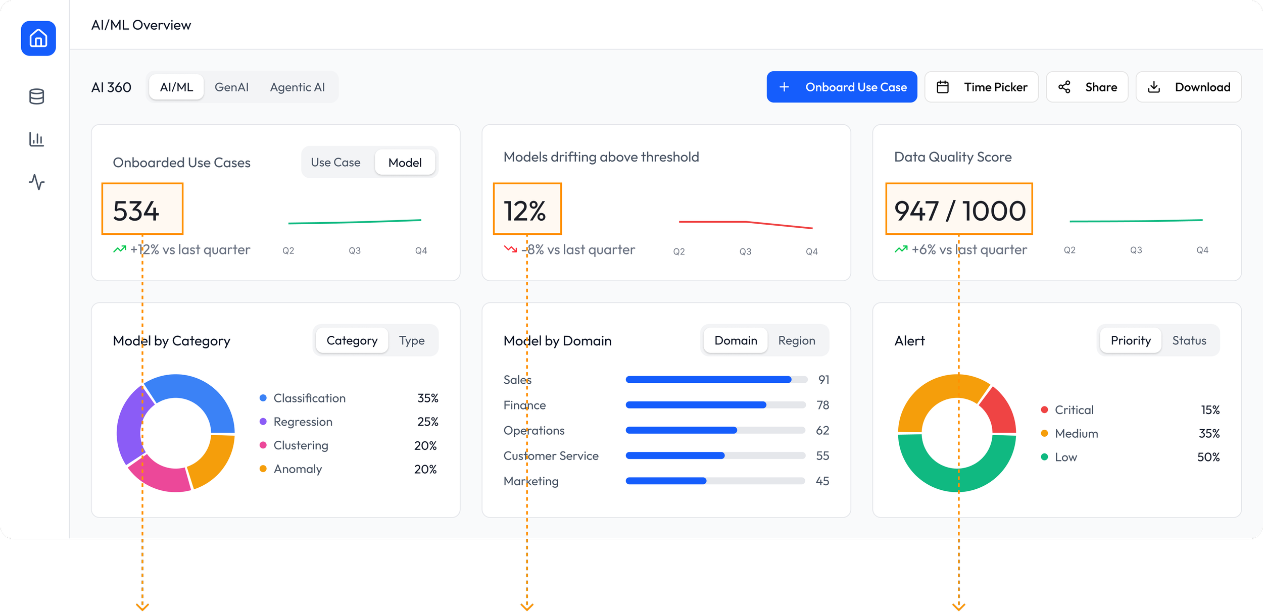
Scalable Enterprise Adoption:
AI 360 enabled teams to operationalize models faster and with higher confidence, resulting in 534 onboarded use cases, a 12% increase vs. last quarter.
Stabilized Model Prediction:
The proportion of drifting models (threshold: PSI > 0.25) decreased to 12%, an 8% improvement from last quarter.
Improved Model Performance:
Data Quality Score increased to 947 / 1000 (+6% quarter by quarter), reflecting fewer quality incidents and directly contributing to stronger business outcomes
Stronger Business Outcomes:
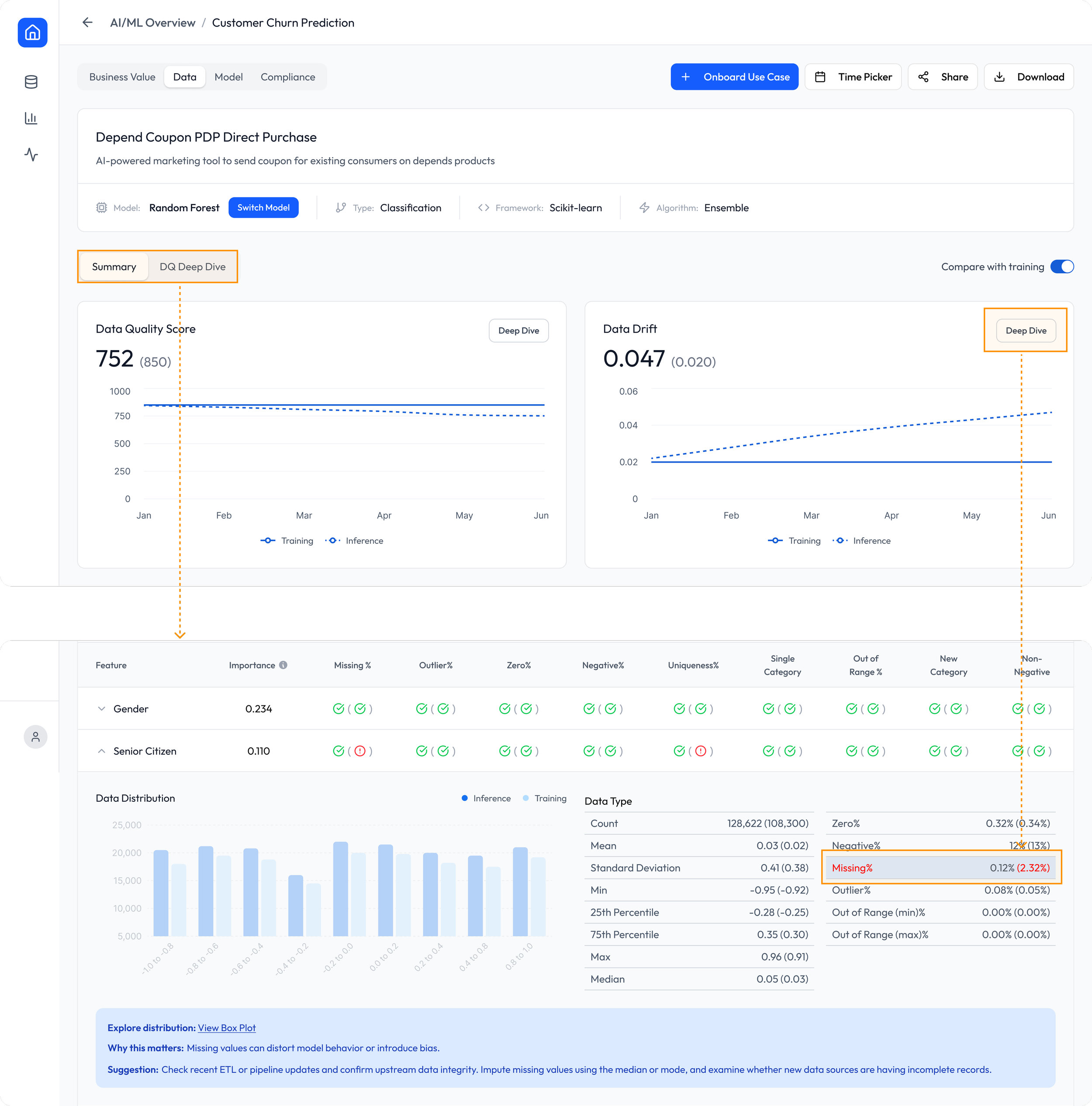
Depend® US coupon model detected unusual data drift:
Deep dive showed 2.32% missing values in the Senior Citizen (65+) feature during inference.
Although small, this missing rate caused the model to underestimate seniors and over-target younger users (a low-redeeming audience)
Impact of the Data Issue
Fewer seniors—the core Depend buyers—received coupons.
More coupons were wasted on younger users with low redemption probability.
Result: coupon ROI dropped, and high-value seniors were underserved.
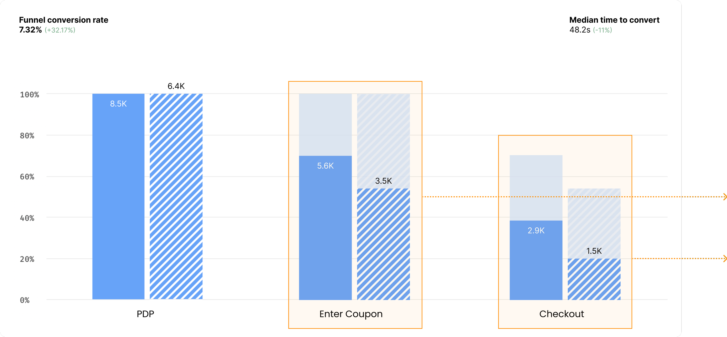
From FullStory (eCommerce Tracking)
Before fix:
PDP visits from coupon emails: 6.4K
Coupon conversion rate: 54%
After fix:
Right buyers received the right coupon
PDP visits increased: 6.4K → 8.5K
Coupon conversion rate improved: +11.2%
Checkout conversion increased: +10.7%
Increased $37K monthly revenue, based on $18 average sales per redeemed coupon